Raising the Bar: Building a Club the Community Calls Its Own
Auckland FC started with a clear ambition: to bring professional football back to the city in a way that felt meaningful, lasting, and built for Aucklanders.
The opportunity came through Bill Foley, an experienced football owner who secured the rights for an A-League team in Auckland. Previous attempts hadn’t stuck. This time, the model was proven, and the intent was stronger. The focus was on building something new that could stand the test of time.


This was a clean start. Auckland FC had no legacy, no existing fanbase, and no past to build on. Everything had to be created from the ground up.
The name “Auckland FC” was chosen to anchor the club in the city’s strong sporting heritage while creating a team that Aucklanders of all backgrounds could call their own. As a city with the largest Polynesian population in the world, and significant communities from Asia, South America, and Europe, the club needed to reflect and engage Auckland’s unique cultural identity.
The challenge was to build a brand that felt authentic to the city and inclusive from day one.
The brand story was written from a future perspective: a bold vision of what the club aimed to achieve, guided by a belief in success through hard work, resilience, and community connection. It took cues from the Black Knights’ playbook and adapted them to fit Auckland’s energy and values.
Grounded in local insight, the brand strategy was shaped through research and engagement with football voices across the city. It set out to challenge the status quo in New Zealand by focusing on access and inclusion, ensuring football was a game for all.
This vision also recognised the opportunity that comes with global ownership. Auckland FC was designed as a digital-first organisation with strong international connections. The multi-club model gave players and staff clear pathways to progress to elite clubs in Europe and beyond.

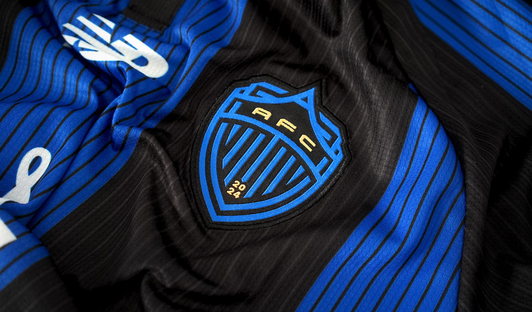
Design that speaks to ambition and belonging.
The identity centres on a bold A, shaped by Auckland’s volcanic geography and forward energy. A woven dual-shield represents the strength of the club’s shared model, while a subtle visor nods to the Black Knights group.
The colours were chosen to stand out. A vibrant RGB blue paired with black connects to Auckland’s sporting tradition while marking a clear difference from other A-League teams. The brand was built to flex across every touchpoint, from grassroots activations to matchday, merchandise to major announcements.

Now, as the inaugural season wraps, Auckland FC has done more than live up to the hype. It’s set a new standard for football in New Zealand.
The club’s debut was one to remember. Winning the A-League Premiers Plate, averaging over 25,000 fans per match, and sparking a passionate, supporters-led fanbase known as 'The Port'.
The matchday experience has changed the game for the A-League and live sport in Aotearoa: family-friendly, inclusive, and made for everyone.
By delivering on its promise in a meaningful, engaging way, the club has redefined what success looks like, not just in football, but across sport in New Zealand.
Season one proved what’s possible when ambition, vision and community align. Auckland FC isn’t just a club. It’s a movement. And this is only the beginning.


